janvier 20, 2007
Metro Station Square of Republic ( Lenin Square)
Loaction: Yerevan / Armenia
Architects: A. Torosian, M. Minasian
Engineers: E. Akopian, A. Oganesian
construction: 1969-1983
It is one of the five stations belonging to the first line of the Yerevan Metro system. Its entrance is situated in the immediate proximity of the main city square, whch is now called the Square of Repubic. An expressive architectral ensemble was formed in the last decades, and this calls for more active use of the underfround space.
The entrance to the station is organized around an interior court with original multipetal composition and a fountain in the center, which is well seen from the square. The decoration of the courtyard walls is made of local ochre-pink Burokan tuff, which matches well with the. monolithic concrete of the yeard. The arcade that is the main architectural theme of the square buildings is continued into the courtyard. The atrium court jusified by the hot Armenian climate creates a transient zone between the outer street space and the underground station. The petal formed ceiling of the vestibule, reflected in the fountain, provides an actively grasped vision of a shortened perspective of architecture surrounding the square.
The white marbled arcade of the central lobby with a floor paved with red polished granite floor. is visually doubled in space due to the back wall of the hall faced with tint speculum gass. The tactuful including of the new construction into the previously formed architecture of the square (rare in the Soviet architecture of the 70s) and the actively expressed public function given to the station entrance hall, all those have rendered a significant influence on the architectural pratice for the years to come.


MATENADARAN
Location: Yerevan, Armenia
Architect: M. Grigoryan
construction: 1944-1959

The issue of national characteristics in new architecture was raised in pre-war years. The search activity was in terrupted by the war and in the following years it was no longer done in a single work scale but in the building of the whole ensembles. Matenadaran, a unique depot of ancient manuscripts, closed the Lenin Avenue perspective and was designed as a concluding chord of a huge architectural composition the beginning of which was defined by a ceremonial building arcade one the Lenin Square. Thie building is ssettled on a mountain slope dominating over other parts of Avenue. The grand access stair is concealed from sight on the roadside. From afar the building is seen as hunge sculptural memorial resting on a powerful pedestal. The slope of green plaeau serves as a background for the gray-blue basalt "monument"
The main volume is resolved in a strict and lapidary cube form. The front facade is dismembered into five strongly drawn out vertical planes. In the center there is a deep persêctive portal with a semicircular completion. The entrance portal is flanked by two deep niches on each side, also inserted as parts of the rectangular facade. The use of decor is brought to a minimum, and the main role is given to a classical approach with a variation play of various proportions of similar forms. The monumental sculptures of Armenian men of culture are placed on the entrance sides in contrast to the delicate cuttings of the wall surface....
A rhythmical play of volumes and planes continues in the interior but the main theme here is a international form-archaism. This artistic method was used by the architect as a means of organic approach to the Armenian national tradition, which is characterised by rationality, organicity and restraint.
Architect: M. Grigoryan
construction: 1944-1959

The issue of national characteristics in new architecture was raised in pre-war years. The search activity was in terrupted by the war and in the following years it was no longer done in a single work scale but in the building of the whole ensembles. Matenadaran, a unique depot of ancient manuscripts, closed the Lenin Avenue perspective and was designed as a concluding chord of a huge architectural composition the beginning of which was defined by a ceremonial building arcade one the Lenin Square. Thie building is ssettled on a mountain slope dominating over other parts of Avenue. The grand access stair is concealed from sight on the roadside. From afar the building is seen as hunge sculptural memorial resting on a powerful pedestal. The slope of green plaeau serves as a background for the gray-blue basalt "monument"
The main volume is resolved in a strict and lapidary cube form. The front facade is dismembered into five strongly drawn out vertical planes. In the center there is a deep persêctive portal with a semicircular completion. The entrance portal is flanked by two deep niches on each side, also inserted as parts of the rectangular facade. The use of decor is brought to a minimum, and the main role is given to a classical approach with a variation play of various proportions of similar forms. The monumental sculptures of Armenian men of culture are placed on the entrance sides in contrast to the delicate cuttings of the wall surface....
A rhythmical play of volumes and planes continues in the interior but the main theme here is a international form-archaism. This artistic method was used by the architect as a means of organic approach to the Armenian national tradition, which is characterised by rationality, organicity and restraint.
HOUSE OF GOVERNMENT
Location: Yerevan, Armenia
Architect: A. I. Tumanyan
Years of Design-Construction: 1926-1940
The house of Government xas erected on the newly designed main city square which has a combined outline of oval and trapezium shapes. The house is the organizing compositional center of the square. Its plan is an exclusive pentango of irregular form. The main entrance is at the central part of the building facing the square. The are also entrances from the northern, southern and eastern sides of the building.
The building facade looking to the square consists of five powerful horseshoe-shaped arches rested upon bundles of columns. Above the arches is one more story with a colonnade loggia along the whole facade...
The passage from the oval to the trapezium part of the square is underlined by a tower. Tamanyan creates a new motif which is inspired by traditional Armenian architectural order. It consists of two stretched columns framing a flat pilaster with a three-edged niche cut in its coreand amalgamated by a plastic fretted capital. Small decorative arches give a plastic expressiveness to the wall. In the center of the whole composition there are bundles of powerful columns bearing"perspectiv" arches. The wall material is tuff of warm pinkish tints. The scale and proportions of separate building parts are subordinated to town-planning requirements. This work of the out-standing architect influenced Armenian architectural development for a long time.
janvier 19, 2007
KAZAKH YURT AND THE ASIAN TENT

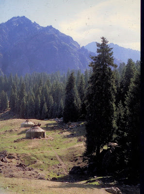
Urumqi, in the northern Himalayas, is the center of the Kazakh culure, which extends to the east of present-day Kazakhstan, northern China, western Mongolia, and southern Russia. The traditional yurts, or tents, are covered mainly with plant fibers and wool, although animal hides are also used. Their structure and, in many cases, their stone bases are indicative of the more permanent nature of the settlements.
Many characteristics of Asia and Middle Eastern peoples are found in the Kazakh culture, stuated in what we today call Kazakhstan. This ethnic group is largely the product of Mongol and Chinese migrations; its language is of Turkish origin, but the predominant language, for commercial and political reasons associated with the group's recent history, is Russian. Many of their cultural manifestations, as well as the composition of their temporary dwellings, are perhaps outgrowths of this geographic location and mix of cultures. The Kazakhs are traditionally nomadic, moving about in search of grasslands for their livestock, mainly sheep.
Du to the climate and the prolonged periods of time for which they resid in each place, their tents, called yurts, are equipped to withstand low temperatures. They are strong structures, yet a little more complicated than the tents of other cultures. Yurist are circular, with a cylindrical permeter that frees up every inch of the interior for use, and are topped by a concical roof. Their sturdy framework is made of approximately 60 interconnected wooden poles, relatively east to assemble and dismantle. The convering of felt, wool fabric, and other plant materials insulates the interior and makes for a smooth, padded outer appearance. This type of tent, halfway between nomadic and sedentary architecture, is representative of many regions of China, Afghanistan, Iran, Turkey, and Russia.
THE TUAREG TENT AND THE WORLD OF AFRICAN NOMADS
The nomadic Tuareg culture, known for its fiercely independent nature, calls the vast area of the southern Sahara home. In the midst of all the constant movement with flocks and camels, instead of producing masks or figures, the Tuareg culture creates an impressive world of beautiful, functional, and abstract objects. The dominant materials are leather, wood, and metal, whichare transformed into clothing, tools, funiture, and homes, Tanned hid, the most common material, is made into sandals, travel bags, milk and food containers, and is one of the many raw materials used in tents.
A strutural detail of a long tent in Niamey. In this case the posts are on the outside, forming a portico, freeing up the interior space and emphasizing the qualities of its structure.
An interior of a Tuareg tent covered by woven palm mats at the site of the ancient sultanate of air in south central Africa. resting in the interior is the large wooden bed, common in the Tuareg culture.
In the Tuareg culture, as in the Gabra culture of northern Kenya, Somalia, and Ethiopia, the word tent (mina or mana) is associated with the concept of marriage (mini fuda) and the setting up of a new household. A marriage celebration consists of a ritual in which the community creates mterials for the construction of a new house. Traditionally, the women own the tents, and are in charge of building and maintaining them. The woman's important role in the society, as preserer
of the oral tradition and as educator, is reflected inside the tent. The interior space, which can be 10 by 16 feet, is divided by central pole or poles; the woman's space is in the western half, where the bed is located. Cultural, social, and family customs are clearly reflected, not just in the distribution of space in the tents, but also in their interior and decoration, via color choices and detailed drawings.
THE VERNACULAR AND DESIGN
Vernacular architectur (I.E. construction by unknown builders) has always been a subject of fascination and study for architects and designers. Le Corbusier, after repeauted trips to India, built several government buikdings and single-family hommes using clear references to traditional Indian architecture. Adolf Loos led some followers to a lake in the Alps, where he stressed that the order of the structures seemed to be the work of God rather than man. Frank Lloyd Wright, whith Bruno Taut and Walter Gropius, among others, established a pilgrimage route to Japan, the inspiration for the design of many of his single-family homes and pieces of furniture. Textile architecture, as an essential part of the vernacular, does not escape this analytical study by architects and designers. It has become a highly complex subject since the dawn of the modernist movement, thanks to technological advances and the development of new materials.
The relationship between specimens of cernacular architecture and design projects is based on the developer's careful study of these structures. One of the most evident features of tents or, for that matter, any example of vernacular architecture, is the close relationship between their function and the socioeconomic context of the area in which they are found. Whether buildings are temporary or designed for long-term occupancy, their structure, construction, materials, and furnishigs are linked to the resources available nearby. The clearest example is the igloo, a temporary home in the skimo culture, located above the Arctic Circle, and an excellent example of sustainable construction.

An abandoned igloo on the arctic tundra of Salluit, in Nunavik, Quebec, Canada.

A panoramic view of a Bedouin tent in the hills east Bethany, Israel.
A glance at the various manifestations of textil architectur with the use of tents offers us a different and timeless perspective on architecture and interior design. Since they are forever being set up and dismantled, tents, and nomadic architecture in general, need a flexible structure and must be easy to transport. They generally take simple geometri shapes based on circular or square forms. Just about any member of the community can handle them, and they are passed down from generation to generation. Consequently, tents (and all nomadic architectur) have no beginning and no end, but undergo constant change as result of their re-use over time.

A temporary settlement of Kazakh tents (yurts) in the Tian Shan mountains, on the border of China and Kazakhstan.

A structure in the northeastern Congo made from tree branches bent into curved shapes and anchored with bark.
The relationship between specimens of cernacular architecture and design projects is based on the developer's careful study of these structures. One of the most evident features of tents or, for that matter, any example of vernacular architecture, is the close relationship between their function and the socioeconomic context of the area in which they are found. Whether buildings are temporary or designed for long-term occupancy, their structure, construction, materials, and furnishigs are linked to the resources available nearby. The clearest example is the igloo, a temporary home in the skimo culture, located above the Arctic Circle, and an excellent example of sustainable construction.

An abandoned igloo on the arctic tundra of Salluit, in Nunavik, Quebec, Canada.

A panoramic view of a Bedouin tent in the hills east Bethany, Israel.
A glance at the various manifestations of textil architectur with the use of tents offers us a different and timeless perspective on architecture and interior design. Since they are forever being set up and dismantled, tents, and nomadic architecture in general, need a flexible structure and must be easy to transport. They generally take simple geometri shapes based on circular or square forms. Just about any member of the community can handle them, and they are passed down from generation to generation. Consequently, tents (and all nomadic architectur) have no beginning and no end, but undergo constant change as result of their re-use over time.

A temporary settlement of Kazakh tents (yurts) in the Tian Shan mountains, on the border of China and Kazakhstan.

A structure in the northeastern Congo made from tree branches bent into curved shapes and anchored with bark.
OLD NEW TENTS
A nighttime view of a Bedouin tent in the United Arab Emirates. Once very popular throughout the Arab world, they are now rarely found in the Emirates.
Tents, associated with the most primitive and natual architecture, have long been part of human history and still play an important role in our lives. Their origin goes back to the beginnings of humankind itself. Remains of 40,000-year-old tents have been found in what we now call Ukraine. Mmammoth bones and animal skins were used to cobble together rudimentary protection from the weather and attacks. Thus, fabric was probably party of mankind's first manufactured shelters. The rapid construction (traditionally with natural elements), easy dismantling, and transporting of tents is closely associated with nomadic cultures. While textile architecture is still associated with temporary, mobile, or lightweight structures, advances in construction techniques and the types of textiles and fibres used in recent decades have expanded the potential for application to contemporary achitecture and interior design projects.
Piet Mondrian & Theo van Doesburg
PIET MONDRIAN:

Piet house

THEO VAN DOESBURG:

Schroder House 1924

The artsits of the De Stijl group demanded objective clarity, a harmonious balance of elementary contracts, and rectangularity. Working with the stark contrast of intersecting black lines on a white backgroun and isolated field of colorr, Piet Mondrian achieved a subtle, perfect balance within a flat surface that nevertheless transcends its own boudaries. Georges Vantongerloo used mathematicazl equations in order to diminish the individual, arbitrary aspect of formal desig. Around 1930, he began to open the elongated sterreometric volumes of his sculptures to accommodate passages for space to flow through, thus creating plastic spatial structures.
These works are as impossible to grasp from a single avantage point as the De Stijl architectures composed of open and closed cubic volumes. Theo van doesburg and Cornelis Van Eestern, as well as Gerrit Thomas Rietveld, designed their projects and buildings with a rich, complex interior and exterior structure. They used surfaces, lines, and colors as vividly contrasting autonomous elements of design to generate numerous different levels of depth while incorporating surrounding space in a a wall relief composed of two-dimensional areas. RHH

Piet house

THEO VAN DOESBURG:

Schroder House 1924

The artsits of the De Stijl group demanded objective clarity, a harmonious balance of elementary contracts, and rectangularity. Working with the stark contrast of intersecting black lines on a white backgroun and isolated field of colorr, Piet Mondrian achieved a subtle, perfect balance within a flat surface that nevertheless transcends its own boudaries. Georges Vantongerloo used mathematicazl equations in order to diminish the individual, arbitrary aspect of formal desig. Around 1930, he began to open the elongated sterreometric volumes of his sculptures to accommodate passages for space to flow through, thus creating plastic spatial structures.
These works are as impossible to grasp from a single avantage point as the De Stijl architectures composed of open and closed cubic volumes. Theo van doesburg and Cornelis Van Eestern, as well as Gerrit Thomas Rietveld, designed their projects and buildings with a rich, complex interior and exterior structure. They used surfaces, lines, and colors as vividly contrasting autonomous elements of design to generate numerous different levels of depth while incorporating surrounding space in a a wall relief composed of two-dimensional areas. RHH
Jean Nouvel
GASOMETER A
Wien, Austria
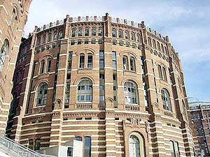
Architect Jean nouvel's propostal to rehabilitate this gasometer was based on the conservation of the genius loci conception of the industrial monument, rebulding the interior while creating a synergy between the weight of the walls and the new building structures; promoting a simpler vision, and at the same time bringing more light into the ensemble.
A simpler construction has been projected for this historic building to contrast with the grandiosity of the existing one. On the lower floors a skeleton of slid concrete gives way to the steel constructions of the upper levels. offering a lighter view. The interior reconstruction of gasometer Ahas been performed in 18 similar segments, which have been structured as housing towers, where the dwellings are divided into 9 independent blocks. The radial organizion and the ravine-style separation between each block allow the inhabitant to enjoy open spaces. This openness is enhaced thank to the light streaming in through wide internal windows, which make up the dewelling's main facade, and through the sklight covering the complex, as well as through the enormous windows in the ceramic wall of the old gasometer surrounding the building. Likewise, the side surfaces of the inter-block space are covered with sheets of stainless steel, reflecting the light from the skylight into the inner courtyard and contributing towards the luminosity of the complex.
On the lower floor of the cylinder there is a shopping center, which is surrounded by a hanging garden and convered by a crystal dome, which lets light into the shops below. The shopping center has surface area of 5300m2 occupyng three floor, the uppermost of which is destined for nigh-time activites, replete with movie theaters and a concret hall.


Ogris: Wanek Architects
House isn
Klagenfurt, Austria
An inherited hous, additions to the family and the adaptation of the building for modem needs formed the basis for the conversion and extension of an existing building. The building is of a typical post-WWWII design that is so often undersetimated typ of construction, being very compact and balanced. When built, the hous was reduced to the minimum standards of the day; now, its siz is not adequate for a nuclear familiy's demands.
Any thoughtless extension of the volume would have affected the original formal air of the building. Hence, the architects sought to preserve the charater of the house.
The development reacts to the conditions of the existing building and to the extension on the garden side, built in the 1960s.
The volume of the south-facing development is only perceptible from the garden. The relation to the public space -with partial views of the new building from the street-can be described as self-confidently reserved.
In connection with the new garage section at the side there is a new structure that is charged with tension. Along with the existing building, it forms a composition of equal construction parts, yet from different times.


Martin Wagner
Apartement Casa Sorée
Carona Switzerland
In the renovation of Casa Sorée, each of the three apartements occupies a single floor, and the hous's three ground-level cellars form a single apartement.
Carona's covered dtreet and porticos have been imitated in an interior street which connctsthe three existing storage cells.
The street extends directly from the ground-floor apartment's main entrance, making the organization immediately apparent upon entry and allowing an extended view through the space. Following local tradition, the entry door opens into the kitchen.
Anew opening joins the kitchen to the existing convered portico for outdoor dining. The second of the apartement's three rooms, used for living, opens to the pre-existing axis, which runs from the fireplace in the back wall outside.
The third room, for sleeping, includes a bathroom enclosed by a high, free-stranding concrete wall which provides privacy and houses the necessary plumbing installations.
The design draws upon Carona's history and built form and takes advantage of opportunities inherent within the existing structure to develop a unique layout for this dwelling.
janvier 18, 2007
LE CORBUSIER

Born in Switzerland in 1887, Charles-Edouard Jeanneret, said Corbusier, is interested in architecture as of its adolescence. After studies at the School of art of the Lime-of-Bottoms, it carries out its first construction in 1905: the Fallet villa. Years of voyages follow then, work and studies. It opens a workshop of architecture in Paris, street of Sevres, in 1922. It is interested in the urbanization and builds various buildings for Rio, São Paulo, Algiers, Antwerp, Geneva and Stockholm. It is with the construction from the Radiant City in Marseilles, in 1952, that it concretizes the synthesis of its ideas on the habitat by using
housing units, the "Modulors", realized according to human dimensions'.
It dies in 1965 by leaving behind him a considerable work which marked a whole generation of architects.
Villa Savoye:

Eduard Broto
Attic at Eixample
Barcelona, Spain
This project by the architect Eduard Broto consisted of rehabilitating an attic located in a 'modernita' (art-nouveau) building in the "right-hand sid" of the Barcelona Eixample district.
Before the restoration, the attic consiseted of a signle room used for storage, and a large terrace.
The scheme made full use of the possibilities of the premises whilst making a minimum number of changes. The traditional character of the building has been conserved in the transformation of an obsolete space into a modern functional building.
A wooden element similar to a cupboard was created. It separates and organizes the different zones into which the dwelling is divided.
The generous height of the ceiling made it possibles to instal a half-floor, thur gaining habitable space.
The living room is situated at the front of the dwelling, and may be fully opened onto the adjoining terrace. The wall and windows of this main room were decorated with the same 'modernista' floral motif that is found on the stair of the building.
At the rear of the dwelling are the kitchen, bathroom and a small bedroom. All of the rooms are interconnected, separated only by a sliding door system. The bathroom, a particularly bright and spacious room, is separated from the rest by mean of a stained glass partition.
STAIRS
Stairs are a primary method of vertical circulation in most private residences and even in public places where elevators or escalatores are present. In elevatored building, building codes will require a minimum number of enclosed exit stairs. Stair construction is typically of wood, metal, or concrete, or a combination of all three.
STAIR TYPES
Straight Run Stair:

Fire codes generally restrict the total rise of a straight stair to 12'-0"(3658) before an intermediate landing is required.
Landing depth should equal the stair width.
L-shaped Stair with Landing:

L-shaped stairs may contain long or short legs, with a landing at any change in direction.
U-shaped Stair with Landing:

U-shaped stairs, which switch back as they ascend, are useful in tight floor plans and as one component in a stacking multilevel circulation system (such as an egress stair core).
L-shaped Sair with Winders:

Winders may help to compress the area needed for a stair by adding angled treads where a landing might go in a typical L-shaped stair. Most winders do not comply with local codes.
L-shaped Stair with Offset Winders:

Offset xinder treads are ore generous in proportion and, therefore, may comply with applicalable codes.
Spiral Stair:

Spiral stair occupy a minimum amout of plan space and are often used in private residences. Most spiral sair are not acceptables as egress stair, except in residences and in spaces of five or fewer occupants in 250 sq. ft. (23 m2) or less.
Curved Stair:

Curved stairs follow the same layout principles of spiral stairs. Though with a sufficient open center diameter, the treads may be dimensioned to legal code standards for egress.
STAIR TYPES
Straight Run Stair:

Fire codes generally restrict the total rise of a straight stair to 12'-0"(3658) before an intermediate landing is required.
Landing depth should equal the stair width.
L-shaped Stair with Landing:

L-shaped stairs may contain long or short legs, with a landing at any change in direction.
U-shaped Stair with Landing:

U-shaped stairs, which switch back as they ascend, are useful in tight floor plans and as one component in a stacking multilevel circulation system (such as an egress stair core).
L-shaped Sair with Winders:

Winders may help to compress the area needed for a stair by adding angled treads where a landing might go in a typical L-shaped stair. Most winders do not comply with local codes.
L-shaped Stair with Offset Winders:

Offset xinder treads are ore generous in proportion and, therefore, may comply with applicalable codes.
Spiral Stair:

Spiral stair occupy a minimum amout of plan space and are often used in private residences. Most spiral sair are not acceptables as egress stair, except in residences and in spaces of five or fewer occupants in 250 sq. ft. (23 m2) or less.
Curved Stair:

Curved stairs follow the same layout principles of spiral stairs. Though with a sufficient open center diameter, the treads may be dimensioned to legal code standards for egress.
Marc van Schuylenbergh
Conversion of Van Schuylenbergh House
Aalst, Begium
Located in a busy street in the Belgian town of Aalst, the architect Van Schuylenberg transformed a century-old worker's dwelling into his own home.
In addition to cleaning the facades and opening new windows in the old building, the architect raised a new, log narrow volume the old building, the architect raised a new, long narrow volume that is attached to the old one through an intermediant space in the form of a wedge that follows the curve of the site. This intermediante space is an area of transit in the interior that is well lit from above. The division between the old wing and the new wing is shown by means of a low curving wall.
In the old volume the pur language of the modern intervention is combined with respect for the singularity of some existing elrments, such as floor tiles, window frames, fragments of rustic wall face and the old staircase.
The distribution of the rooms has hardly been changed: there are two bedrooms, one situated behind the other, a narrow hall and a staircase.
Another of the most important elements of the new scheme is a raised walkway that communicates the main bedroom with its bathroom, both of which are located on the first floor over each of the two volumes of the dwelling.
Albori Associati ( E. Almagioni, G. Derella, F.Riva)
CASA EN APPENNINOS
Motese, Italy
This old farmhouse of an uncertain age, which has been remodelled several times, is set on a hiliside of the Apennines in the region of Modena.
The idea of its new owners was to reduce the bathrooms and bedrooms as far as possible in order to leave the rest of the spaces open and at the disposal of the house.
Because it was a building without partitions, in which the interior space coincided with the structure, most of the rooms were on different levels. This pure relationship between space and structures was so beautiful that it was not altered.
Therefore, none of the rooms were divided and the new volumes are characterized by the type of material of the furniture inside them: wood, bricks and stone help to define the uses of the different rooms. The main barn had a certain majesty, with an irregular geometry, a floor area mesuring 48 m2 and a roof that is 6 meters high at its highest point and 2.4 meters at its lowest point.
After the demolition of the floor located between the ground floor and the first floor, a large room of double height perfectly illuminated by a long thin skylight was created.
The darkest area in the dwelling was illuminated thank to the courtyard located at the end of the old barn. I order to adapt this impressive building, originally designed for agricultural use, it was necessary to redesign its lighting and ventilation, without forgetting the enormous possibilities of making openings due to the excellent location. The beautiful view of the valley and hills surrounding this hous were accentuated by the creation of large terrace in the east wing of the dwelling and by the creation of new windows. These openings led the architects to create a circular layout full of transparencies and unexpected views through the rooms and toward the exterior.
Maurice & Enrico Cerasi
CASA VILLAZZI
Milanino, Italy
Villazzi Hous is located near Milano in one of the area's most importat garden cities. Due to its designation as a protected area, an analysis of the site was undertank before planning the design.
Rather than imitating the preexisting architectural elements of this garden city, the architects chose to reinterpret them, elaborating on a languange that respects the character of this historic area. The house's body had to be adapted to the structure of a residence built in the 1950s . This articulation is seen in both the facades and the various levels. Unification of volumes and treatment of finishes between the new and old structures was not attempted. ight gray cement and marble powder plaster are set against cement plaster in yellow quatz paint - the smooth surface treatment of the former contrasting with the horizonal grooves of the latter.
Built in three years, the hous has six levels and a surface area of more than 4304 ft. The conservation of the corridor and wooden stairway in the center of the house prevented the creation of an interior perspective from the street to the garden and necessitated a more traditional interior distribution throughout the house. Access is gained through an entrance courtyard, which is set just below street level and covered by a pergola. The lime trees along the street tastefully accentuate the elegant neoclassical facade.
The formal result has recours to the language of the classical past with references to Hellenic architectur, and recaills such masters as Palladio or Schinkel, nullifying the rigor imposed by the original foundation.

janvier 17, 2007
I. M. Pei

I. M. Pei, from Canton, China, decided to become an architect in 1933, at the age of 16, on seeing his firdt skyscraper under construction--the Park Hotel, Shanghai. He went to MIT in 1935, and studied architecture there and (in 1942-3) at the Harvard Graduate School of Design. His great admiration then was Le Corbusier, is now Picasso. After graduating he joined the office of John M. Gray, in Boston, where the buisness-like atmosphere may have prepared him for his later success in working with big buisiness organizations. His first major independent commission--and frst demonstration of buisness-like qualities--was the Gulf Oil Building in Atlanta, Georgia, which had to be built within $8 per square foot, air-conditioned and turned out at seven-fifty. His second commission was for the ‘ fabulous’ offices of the Webb and Knapp organization (illustrated), the fruit of his working collaboration with William A. Zeckendorf, head of Webb and Knapp and leader of the ‘enlightened realtors’, for whom he also designed Mile High Center in Denver, Colorado, and the Roosevelt Field Shopping Center on Long Island. Pei’s office concentrats mostly on commercial buildings and urban redevelopment shemes.
Hollywood High School Science Building
1934-35
Marsh, Smith, and Powell
Northwest corner of Sunset Boulevard and Highland Avenue Monumental Streamline Modern given juice by high-minded slogans at appropriate places and a characteristic Federal Arts Project bas-relief by Bartolo Mako over the door. In the school library is a "mural, Education", by Haldine Douglas. This was painted in 1934.
American Legion Headquarters building 1929
Weston and Weston (Eugene Weston, Jr.)
2035 Highland Avenue
Goodhue's Los Angeles Public Library certainl was on the architect's mind when he designed this modern Classical spectacle; its glittering tile ornamentation is still very fresh.
The building is of reinfoced concrete with the board pattern of the forms left exposed.
2035 Highland Avenue
Goodhue's Los Angeles Public Library certainl was on the architect's mind when he designed this modern Classical spectacle; its glittering tile ornamentation is still very fresh.
The building is of reinfoced concrete with the board pattern of the forms left exposed.
FALLINGWATER ( franck lloyd wright )
The Edgar J. Kaufmann Sr. Residence, better known as "Fallingwater," was built in 1936 over a waterfall on Bear Run near Ohiopyle, Pennsylvania.
Considered by some to be the most famous non-royal private home in the history of the world, Fallingwater is one of the seventeen buildings designated by the American Institute of Architects to be retained as an example of Wright's architectural contribution to American culture. The house, its contents and its surrounding nature reserve were presented to the Western Pennsylvania Conservancy by Edgar Kaufmann, Jr. in 1963. The only remaining great Wright house with its setting, original furnishings, and art work intact, Fallingwater is open to the public for guided tours during most of the year.


Considered by some to be the most famous non-royal private home in the history of the world, Fallingwater is one of the seventeen buildings designated by the American Institute of Architects to be retained as an example of Wright's architectural contribution to American culture. The house, its contents and its surrounding nature reserve were presented to the Western Pennsylvania Conservancy by Edgar Kaufmann, Jr. in 1963. The only remaining great Wright house with its setting, original furnishings, and art work intact, Fallingwater is open to the public for guided tours during most of the year.


Pietro Belluschi

Pietro Bellushi comes from Ancona, in Italy, Where he was born in 1899. He passed, by way of training in Rome, and a degree n civil engineering at Cornell, to the office of A. E. Doyle in Portland, Oregon, which he served as chief designer from 1927 until the firm was dissolved in 1943. He then set up his own practice, but this, in turn no longer exists as a normally constitutd office and since he was made Dean of Departement of Architecture at MIT, Belluschi has wored as a roving consultant in design, especially in the fields of church architecture, shopping centres, and office buildings; His work in these three fields is so dramatically dissimilar that he eludes routine evaluations as an architect in terms of styl--whether personal or generalized--and he has been appreciated mainly for his achievement in building up a position in which he can design buildings that commad respect in the often deadening mental climate of a provincial city--though in this respect Portland is a a-tyical as he is. But the stylistic adaptability is as integral a part of his make-up as the community-con-scious, for both are aspects of what he calls ‘the kind of integrity that breeds variety as nature will have it’--nature in this instance clearly subsuming the character of the community as well as the building’s function.
His churches and houses, wood-framed, wood-clad, and often likened to local barns, were early in the field of ‘red-wood vernacular’ and were taking circumspect note of Japanese architecture as long ago as 1938. On the other hand, his business buildings, square, smooth and sharp-edged, include in their number the Equitable Building of 1948, which anticipates much of what was later to be done at UN and Lever House.
FINE ARTS BUILDING 1925
Walker and Eisen
811W. 7th Street
The street facade of this twelve-story building displays a highly original use of Romanesque (the Catherdral at Lucca comes to mind).
Twisted windows, and elongated columns were all employed. The tripartite division of the facade has taken into account how the building is viewed; it is subtle close up at the street level, large and bold at the top so that it will make an impact from a distance. The tour-de-force of the building (and a must to see) is the two-stroy, arcaded main lobby with its rich surfaces and ornament produced by the til-maker Ernest Batchelder.
CROSSROADS OF THE WORLD 1936

Robert V. Derrah
6671 Sunset Boulvard
The theme is set by a Streamline Moderne ship sailing into Sunset Boulvard with a tall, open tower ( supporting a lighted globe) on its prow. Go to the stern and you will find shops in the spanish Colonial, Tudor, and French Provincial modes. The architect has carried the concept of the 1920s pedestrian mall into the new streamline age of the mid-1930s. It is perphaps significant that Derrah is one of the few architects to have two of his buildings declared cultural-his-toric landmarks by the Los Angeles Cultural Heritage Board. The other is the equally remarkable Coca-Cola Bottling Plant near downtown Los Angeles.
Mies van der Rohe

Mies van der Rohe, at the age of seventy-three, and a long way from his nativ Aachen, has become, for many among the middle and younger generation of architects, the living embodiment of a moral absolute. Quite what this is they would most of them find it hard to define, and since architecture seldom prospers alongside moral absolutes, it is just as well. What they do see quite clearly is a poet of metal and glass, of the fin edge and the moulded profile, above all a master of the rectilinear in plan, elevation and volume and in the relationship of building to building. His approach is oppositite to that of Frank Loyd Wright and no two buildings could better ewemplify the difference than the two master’ first major works to be built in New York which have risen, by a coincindence, almost simultaneously; No. 375 Park Avenue (the Seagram building) is sheathed in autumnal bronze; crisp and rectilinear it soars to the sky without emphatic termination.
The Guggenheinm Museum on Fifth Avenue is curvaceously moulded, ground-hugging, even ground-penetrating with a spiral terminated by a glass dome, reading as much downward as upward. The two buildings represent the polarities of modern architecture, metallurgy and the machine serving the purposes of the multi-cellular building, on the hand, and the structural versatility of reinforced concrete used to make a formal statement about a unique problem, on the other; both approaches are as valid as they are necessary.
However true it may be that the famous Lake Shore Drive towers are the fulfilment of the dreram of a glass skyscraper that had exercised Mies in Berlin as early as 1919, however true it may be that he is ‘always the same Mies’, the fact remains that his coming to America in 1938 marks a real break in his career, and his American architecture is very unlike that which he had earlier done in Europe. The earlier body of work had consisted mostly of small buildings and larg projects--except for the Weissenhof-seidlung of 1927, but, as Germany’s intellectual life contracted towards the null-point of 1933, even small commissions became scarce and it was left to Mies, as its las director, to turn the key on what remained of the Bauhaus--and on what remained of an adventure, a generation, a dead world, In its own good time the New World offered him the chance to realize his large projects; offered him the necessary patrons, the materials, the techniques, the engineers and collaborators--and the IIT ampus, as its buildings were completed one by one over the years on his twelvefoot planning grid, revealed to US architects an extreme point in architectural integrity, a right rectangular aesthetic of structur and space; This aesthetic, summed up in two basic Miesian sayings, ‘Wenige ist Mehr” and “Beinah Nichts” (Less is More, and Almost Nothing) has been called the ‘Absence of Architectural’, but on a middle generation of Americans it has reacted as a positive presence, and as Mies has gone on developing it, refining and subtilizing its structural forms and formal structure, a gaint ghost has followed it at a safe and not-quite-comprehending distance--the curtain wall industry.
For, though Mies’s achievement coul hardly be more personal, the superficial appearance of the buildings in which that achievement is embodied has facilitated the visual acceptance of a repetitive, endless, grid facade, while the work of two architects most ready to admit his influence, Eero Saaineb and Gordon Bunshaft, has effectively bridged the gap between one man’s vision and an industrial product.
American could not have nurtured Mies, Europe could not have fulfilled his promise; he has, perhaps, gained more, and given more, to the US than any other “émigré” outside the realm of atomic physics. He has produced a lyricism of two constituent US psychological fact--unlimited spac and unmitigated tchnology--in a from that is neither provincial nor crude, and can be held up to the rest of the world as an example of a convincing machine-age architecture. The rest of the world has taken note and, wherever architectural tthought is on the move, the influence of Mies--American Mies--can be felt.
FARNSWORTH HOUSE 1950 (Mies van der Rohe)

barcelona pavillion
janvier 16, 2007
Health-Improving and Office Center of the Kiev-Donbass Company
Location: Kiev
Architects: V. Zhezherin, O. Matienko
construction: Ya. Vladimirsky
construction: 1984-1996
The Health-improving and Office Center is a multifunctional building belonging to a large firm. It is a rather new type of construction, which has been developed in Ukarine only in the last years. The building is located in the city center and participates actively in froming its architectural space environement. The architect's focus was to design a new space is organized at the levely of the pedestrian zon of the adjoining area. The lower part of the building is open as much as possible towards the city, but nevertheless it does not merge with the space of the square and creates its own world: a homely one and human by scale. The internal court is well equipped, its image is organically completed by the sculptural composition installed there.
Inside the building, apart from the comfortable office premises, two bathing houses with health-improving complexes and small pools have been provided. These complexe offer a broad set of services for the inhabitants and include message cabinets, solariums, a beauty salon, a fitness center, and also several bars. On the flat roof of the building a restaurant for 70 places is situated. Here in a hot season one can take advantage of the comfortable terrace with a lot greenery. All the construction works are executed on an exclusively high level. The most advanced decoration materials are used.
The compositionof the elevations is based on a contrast between the fractional surface of the facing brick and the well revealed horizontal belts in plaster. The colorful solution of the facades is stressed by window panes in aluminum and by stained-glass windows. The elements in stainless steel are successfully apllied. The columns are encased with it and it is also used for the constructions holding the advertising and the spire - the finishing feature of the small corner tower, which gives a completeness to the whole composition.
Architectural Faculty of the Kiev Institute of Civil Engineering
Location: Kiev
Architects: L. Filenko, V.Korobka, M.Gershenson
Engineer: L. Linovich
Completation : 1982
The building is located on the territory of the institute of Civil Engineering, and compses a final element in the existing compex composition, The building of the architectural facuty sides with the sports hall and ties in with it in scal, height and mass articulation. The main premises consist of 30 drawing-planning room, 4 halls for illustration and painting, a sculptural workshop, a main hall of 150 seat, a library with reading hall, faculty rooms, dean's office, model mock-up worshops and a number of auxiliary offices and tchnical premises. A peculiarity of the education program is the provision of a permanent working place for each student in the drawing-planning rooms, with sizes of 9m x 12m long panels with box sections used as air-ducts, 9 m Tshaped and 6 m hollow-cor panels resting on panel walls. Proceeding from the requirements of zeven illumination, the system of top lighting is used in drawing-planning room. For this purpose specially designed skylights with jalousie are used. As a result, a capacious structure 54m x 114m dimension in plan is created which attains highly efficiency i territory use. Particular attention is paid to the combination of decoratiove materials and glazed srfaces of satiated brown color, ceramic tiles of light pastel ton and goldish anodic aluminum.
The laconic linear scheme of the functional plan fully corresponds to the spatial rhythm of the facade articulation: on volume - on hall. The building composition is united by recreation galleries, the interor of which is enriched by sculptures.
GORODETSKY'S Apartment Bulding
Location Kiev / Ukraine
Architect: V. Gorodetsky
construction: 1911
The architect's own house is located on a precipitous relief. The bulding is very complex in its volumetric and spatial solution? It has four stories on the main facade side and six on the opposite sid. The house has a flat roof. The free planning structure of the detached hous is typical for the beginning of 20th century. Main attention is paid to the creation of comfortable conditions and functional interconnection of isolated groups of premises (ceremonial, dwelling, household). The construction is of interest due to its original decoration that is inexhaustible in fantasy and virtuosity and demonstrates the plastic proporty of cement.
The author of the sculptural decoration is Elia Salia. The original architecture personifies early modern style experiments in the field of shape formation and decorativ arts expressed in particular in sculptural adornments, the themes of which are the ground and the submarine fauna worlds, hunting articles, and fairy-tal creatures. The rich stucco molding, in similr themes can also be seen in the show halls of the interior, Sculptures on the facade are concentrated mainly on the top party of the building. The plinth wall faced with brutal (natural) ston is more typical of the neoclassic architecture Whereeas in classical examples of Russian modern style the plastic form usually belongs intrinsically to the architectural itself, here the "organic" sculpture was put on the stricitly rectangular building volume quite traditional in its character.
KRESHCHATIK (UKRAINE)
Location: Kiev
Architect: A. Vlasov, A. Dobrovolskii, B. Prigman, A. Zavarov and others
Construction: 1947-1954
Kreshchatik is the main and on of the most ancient streets of Kiev, a city almost completely razed during World War II. The supremacy of Kreshchatik Street is not only derived from its poly-functionality (it is a business, cultural, shopping center of the city and at the sam tim links the central regions with a park near the Dnieper river), but also comes from the features of the historical layout of Kiev. The city existed without a predominanting central square and the sematic and artistic functions of the city center wer assumed by kreshchatik. A challenge for the architects--to open the space of adjoining hills ( the street lies on the bottom of a ravine and it was inadmissible to close from the view the surrounding picturesque green heights with a blind front of buildings, as it had been before the World War II) and at the same time to follows the predominanting direction and unity of the street, so as to create an amorphous space sensation.
The reconciliation of these two seemingly alternative requirements was made by the architects in an unusual planning mod through th difference in spatial solutions of the even and odd sides of street. The even sid--its role is dominating--has a compact frontal disposition of buildings. On the uneven side, along which a broad boulevard lasts, the buildings are separated with a considerable distance. Throungh the gaps betwwen them the greenery from the nearby hills is descending like streams running to river.
The composition solution of the buildings on the uneven sid reminds one in many respects of an enormous theatrical decoration, where in the "wing" of greens a building emerges from which the stairs, supprting walls and ramps run down to the sides and hid themselves in the surrounding greenery. In Kreshchatik this "theatrical" principale has brought very rich spatial planning effects.
novembre 24, 2006
JEU DE PAUME
La Sale de jeu de paume et Construit sous Napoléon III dans le Jardin des Tuileries, En 1909 la salle devient un lieu d’expositions un véritable musée.
Dès 1930 (Modigliani, Van Dongen, Picasso, Chagall, Soutine, Juan Gris, Foujita, etc.) y trouvent leur place.
En 1932, . Des expositions d’art moderne y sont organisées jusqu’à la Seconde Guerre mondiale. Pendant tou la durer de la second geurre mondial touts les euvre d’art son garder dan le muse un véritable entrepôt où seront engrangées des œuvres ainsi que de grandes collections confisquées à des amateurs d’art juifs.
En1947 le Musée du Jeu de paume accueille l’école impressionniste.
en 1958, les salles climatisées et dotées d’un dispositif d’éclairage naturel offrent une nouvelle présentation des œuvres impressionnistes
En septembre 1987 le batiment et réaménager par l’architecte Antoine Stincoen créant des espaces d’exposition supplémentaires, une salle audiovisuelle, une librairie et un café. Les salles, aux volumes variés, jouent avec la lumière naturelle et offrent des échappées sur le Jardin des Tuileries
Quelques chiffres concernant le bâtiment :
Longueur et largeur : 80 x 13 m.
Surface utile : 2 754,50 m2.
Surface d’exposition : 1 137 m2. Soit 9 salles sur 3 niveaux et 420 m linéaires de cimaises.
Hauteur sous plafond dans la plupart des salles : 4,50 m
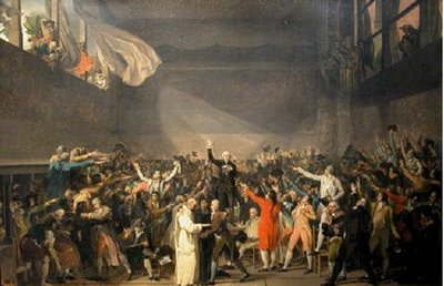
Le serment du Jeu de Paume (Esquisse 1790)
Dès 1930 (Modigliani, Van Dongen, Picasso, Chagall, Soutine, Juan Gris, Foujita, etc.) y trouvent leur place.
En 1932, . Des expositions d’art moderne y sont organisées jusqu’à la Seconde Guerre mondiale. Pendant tou la durer de la second geurre mondial touts les euvre d’art son garder dan le muse un véritable entrepôt où seront engrangées des œuvres ainsi que de grandes collections confisquées à des amateurs d’art juifs.
En1947 le Musée du Jeu de paume accueille l’école impressionniste.
en 1958, les salles climatisées et dotées d’un dispositif d’éclairage naturel offrent une nouvelle présentation des œuvres impressionnistes
En septembre 1987 le batiment et réaménager par l’architecte Antoine Stincoen créant des espaces d’exposition supplémentaires, une salle audiovisuelle, une librairie et un café. Les salles, aux volumes variés, jouent avec la lumière naturelle et offrent des échappées sur le Jardin des Tuileries
Quelques chiffres concernant le bâtiment :
Longueur et largeur : 80 x 13 m.
Surface utile : 2 754,50 m2.
Surface d’exposition : 1 137 m2. Soit 9 salles sur 3 niveaux et 420 m linéaires de cimaises.
Hauteur sous plafond dans la plupart des salles : 4,50 m

Le serment du Jeu de Paume (Esquisse 1790)
novembre 22, 2006
Gréce
La civilistaion Grece :
Chaque dieu a son propre temple, et l’un diferent de l’autre
En Gréce les block de pierre son beaucoup plus petit que celui de l’egypte et la maneuvre et plus facile.
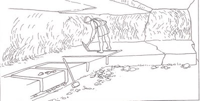
Outiles de masson :
Ciseau
Pioch
Marteu
Achete
Des equeére
Le fil a plomb
Les Grec son trait avancer en geometri par rappor au Egyptiens.
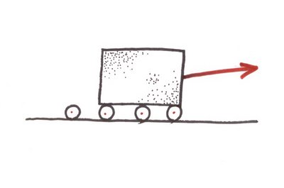
Pour deplacer les blocs de pierres Ils utilisent le system de glissade sur des roues,
Car ils avait cette connaissance des roues.
Ils utilise aussi la roue pour pouvoir déplacer des trait grands morceaux de pierre, qui ce travail par la suite pour les transformer en colonnes
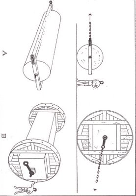
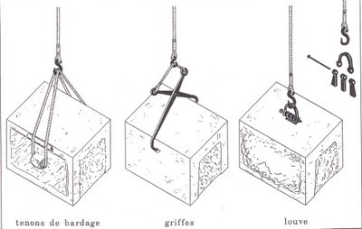
Le Grec on inventait la poulie ( la grue) avec un diferent system d’accrochage de block de pierre a la corde pour pouvoir les soulever.
Ex :
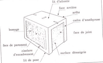
L’économie de l’assemblage de pierre :
On a pas besoin que toutes les cotes des pierres soient lisses

Chaque dieu a son propre temple, et l’un diferent de l’autre
En Gréce les block de pierre son beaucoup plus petit que celui de l’egypte et la maneuvre et plus facile.

Outiles de masson :
Ciseau
Pioch
Marteu
Achete
Des equeére
Le fil a plomb
Les Grec son trait avancer en geometri par rappor au Egyptiens.
Pour deplacer les blocs de pierres Ils utilisent le system de glissade sur des roues,
Car ils avait cette connaissance des roues.

Ils utilise aussi la roue pour pouvoir déplacer des trait grands morceaux de pierre, qui ce travail par la suite pour les transformer en colonnes

Le Grec on inventait la poulie ( la grue) avec un diferent system d’accrochage de block de pierre a la corde pour pouvoir les soulever.
Ex :

L’économie de l’assemblage de pierre :
On a pas besoin que toutes les cotes des pierres soient lisses
